![]()
This week we are talking to Sam Maclay and Zak Rutledge of 3 Advertising in Albuquerque about the brand strategy behind the incredible work they did for pro soccer team, the New Mexico United. Stay tuned for some insight and a peek behind the scenes of a state-wide campaign!
![]()
“If you notice on the left side of the shield, it’s open. The ownership group, and Peter Trevisani, wanted a very inclusive feel to the team and the logo, and the whole concept of the team. It’s really much more than just bringing a soccer team to the state. Going through our process with him that’s what we really learned. It’s like this is about bringing a whole state together and creating a source of pride and community and something we can all be behind.” -Sam Maclay
“Speaker 5: (21:28)
Yeah. I was wanting to create something real graphic and minimalist for this and yeah. And there’s this kind of cropped and Zia that I hadn’t really seen much. Then the diagonals really, I could see that it had legs in the campaign and also it kind of, those diagonals are used in other like pro soccer team in European style logos, which I thought was kind of good tie-in to the sport. ” -Zak Rutledge
We are reading and reviewing books on the podcast every quarter!
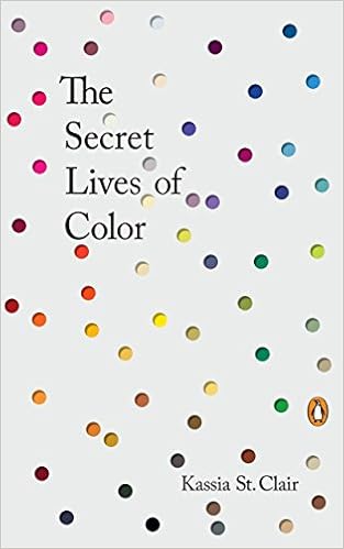
If you would like to read along, THIS QUARTER, we’ve been reading, The Secret Lives of Color by Kassia St. Clair.

Go to Patreon and help support our podcast!
Find us on all forms of social media via @BrandiSea on Instagram, Twitter, Facebook, and you can email us any burning questions you want Brandi to answer on an episode at brandi@brandisea.com.
THANK YOU to the ultra-talented Vesperteen (Colin Rigsby) for letting us use his (“Shatter in The Night”) track in every episode of Design Speaks.
TRANSCRIPTION